Customizing daisyUI themes for accessible color contrast
TLDR
Use Color.review with automated accessibility tools like Firefox accessibility checker to create accessible daisyUI themes.
What is daisyUI?
daisyUI is a fantastic component library based on tailwind. I like using it with tailwind because it allows us to replace long, indecipherable strings of tailwind classes with semantic component class names.
For example, to style a button with tailwind, you’d write:
<button
	class="focus-visible:ring-offset-2 inline-block cursor-pointer rounded-md bg-indigo-600 px-4 py-3 text-center text-sm font-semibold uppercase text-white transition duration-200 ease-in-out hover:bg-indigo-700 focus-visible:outline-none focus-visible:ring-2 focus-visible:ring-indigo-600 active:scale-95"
>
	Tailwind Button
</button>
With daisyUI, you’d write:
<button class="btn btn-primary">daisyUI Button</button>daisyUI doesn’t entirely replace tailwind, but it does improve the developer experience of creating common components.
daisyUI themes
daisyUI also comes with 20+ themes which
help us create consistent styles across its components. We can leverage the
selected theme colors with
semantic color class utilities like
text-primary or bg-accent.
The challenge with daisyUI themes
As wonderful as they are, daisyUI’s themes have a hidden challenge: accessible color contrast.
I first noticed it while browsing the button component docs. My operating system theme preference is dark so the docs default to the “dark” theme. I love this but noticed the link button has dark purple text and a dark gray background:
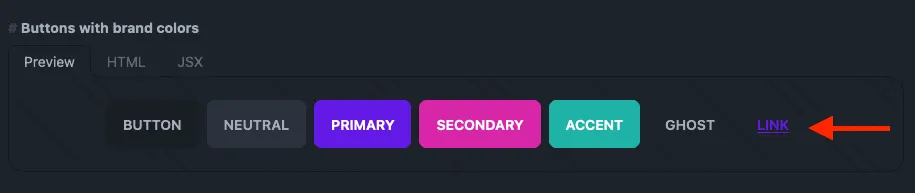
It feels too washed out, even as someone with no vision deficiencies. I figured this was minor and isolated to this specific instance.
I was wrong.
Outline badges,
chat bubbles with color,
accent text (i.e. <p class="text-accent">Accent text</p>), and
primary color links all
have insufficient color contrast. And that’s only with the dark theme.
The daisyUI doc page on colors doesn’t mention anything about accessibility either 🤔.
I jumped into daisyUI’s issues, thinking I must’ve missed something in the docs about accessibility. Or maybe I needed to add a modifier to my class names to use a lighter or darker version of the color (i.e. Vuetify’s material colors with lighten and darken modifiers)?
Searching for issues that include “accessibility” shows I wasn’t the first to run into this. Issues #1174 and #1415 reveal we’re on our own when it comes to creating components with accessible color contrast.
Side note: I understand why it’s this way. This is free software and Pouya is a saint for giving us daisyUI. I genuinely appreciate the time and effort that’s gone into building daisyUI.
Diagnosing accessibility issues
Despite these issues, there is a path forward. Most browsers ship with accessibility tools built into the dev tools. There’s even a W3C page with 100+ tools for automating accessibility testing.
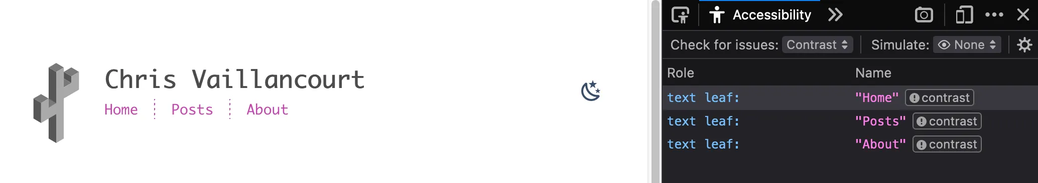
Chrome shows accessibility issues when inspecting elements with insufficient color contrast:
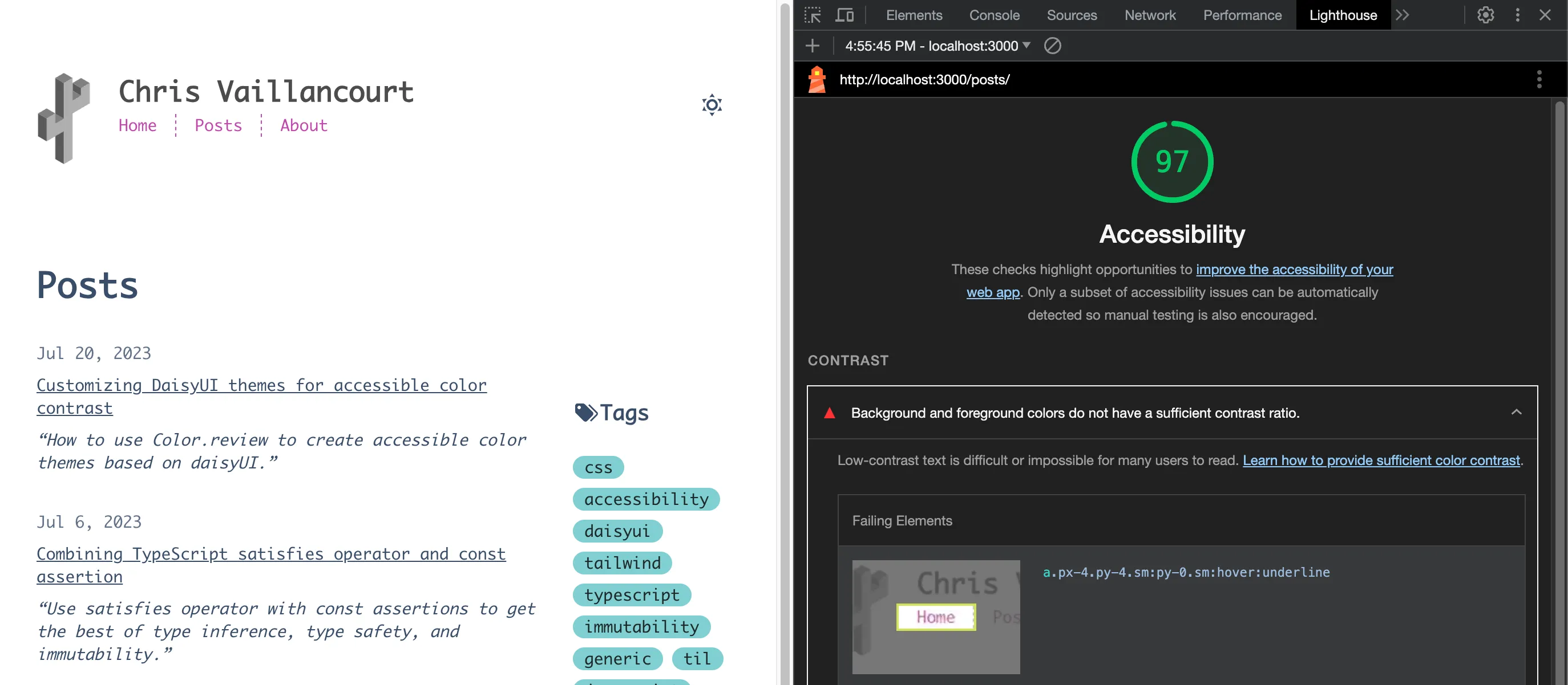
Chrome’s lighthouse also has accessibility tests which makes it easy to find accessibility issues for the entire page:
Firefox also has an Accessibility Inspector in its dev tools so we aren’t limited to Chrome.
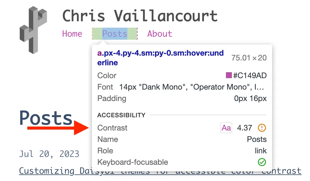
Here’s the result of running Firefox’s accessibility inspector on the posts page:
Finding the problematic theme color
Once we have a daisyUI theme and a tool to find accessibility issues, we’re ready to start. I’ll use the “winter” theme and Firefox’s accessibility checker.
Looking at the accessibility reports, we see three text elements with contrast
issues caused by the pink text on a white background. The text color comes from
the class="text-accent" snippet:
<nav class="text-accent">
	<!-- irrelevant code omitted -->
</nav>
Initially, we set the daisyUI theme in our tailwind.config.ts (or .js) with
a string matching the name of a
daisyUI theme:
export default {
	// other config omitted
	daisyui: {
		themes: ['winter'], // or whatever themes you want
	},
};
Instead, we need to import our theme so we can selectively override the problematic color:
import daisyuiThemes from 'daisyui/src/theming/themes';
// other tailwind imports omitted
export default {
	// other config omitted
	daisyui: {
		themes: [
			{
				winter: {
					// shallow copy winter theme properties
					...daisyuiThemes[`[data-theme=winter]`],
					// custom color for `accent` property
					accent: '', // We'll add this next
				},
			},
		],
	},
};
If we view the imported daisyuiThemes object, we can see the following object:
{
  // other themes omitted
  "[data-theme=winter]": {
    "color-scheme": "light",
    "primary": "#047AFF",
    "secondary": "#463AA2",
    "accent": "#C148AC",
    "neutral": "#021431",
    "base-100": "#ffffff",
    "base-200": "#F2F7FF",
    "base-300": "#E3E9F4",
    "base-content": "#394E6A",
    "info": "#93E7FB",
    "success": "#81CFD1",
    "warning": "#EFD7BB",
    "error": "#E58B8B",
  },
}
Since the class that’s causing the issue is text-accent, we know (see the
daisyUI docs on how to use colors with utility classes)
we need to change the accent property so it’s darker on the white background.
I prefer using Color.review to find accessible colors.
The thing that separates it from other tools is the way it visually represents
the three WCAG standards for color contrast for a given color. It does this by
drawing lines across the across the 2D color space for each of the three
recommended contrast ratios. For example, the three white lines show the
accessibility cutoff for the default accent color "#C148AC" on a white
background:
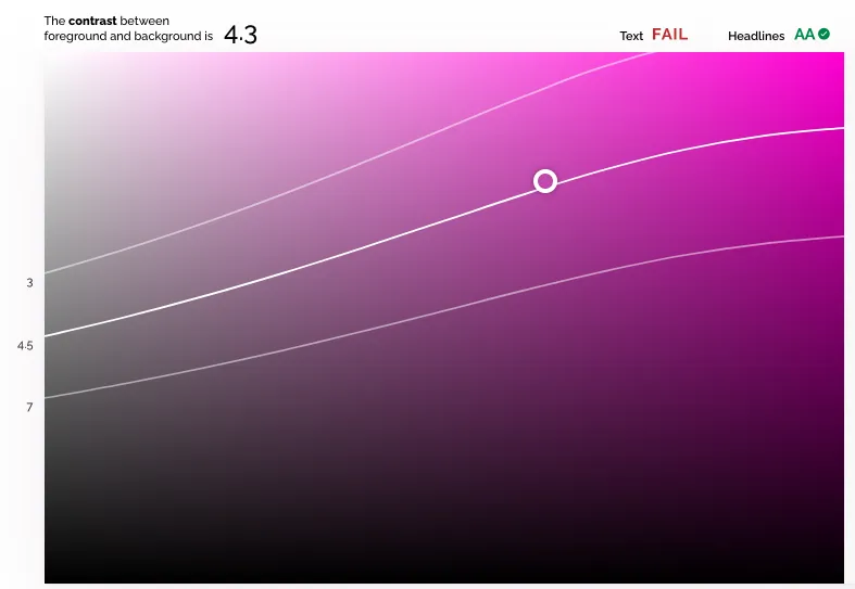
To meet the AA WCAG guidelines, we need a contrast ratio of:
- 4.5 for text (i.e. paragraph text)
- 3 for headlines, large text, and other inactive interface elements (controls, buttons, loading indicators, etc.)
With this visualization, we can tell the “winter” theme’s accent color has a 4.3 contrast ration with a white background. This passes the AA minimum ratio of 3 for headlines and large text but fails the 4.5 ratio for smaller text.
Since the nav links in question fall into the small text category, we know we need to bump the contrast level up a little to meet the 4.5 standard.
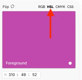
The easiest way to get there is to toggle the HSL (H: hue, S: saturation, and L:
lightness) color mode above the foreground color input. With that toggled, we
see the accent hex color code converted from #C148AC to h: 310, s: 49, and
l: 52.
One easy way for us to increase the contrast with the white background is to decrease the lightness number until we hit 4.5. Dropping the lightness from the 52% (default) to 51% does the trick:
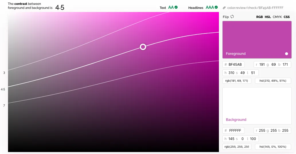
Next, we need to copy the hex code for the modified color ("#BF45AB") since
that’s what the daisyUI theme config expects:
import daisyuiThemes from 'daisyui/src/theming/themes';
// other tailwind imports omitted
export default {
// other config omitted
daisyui: {
themes: [
{
winter: {
// shallow copy default winter theme properties
...daisyuiThemes[`[data-theme=winter]`],
// custom color for `accent` property
accent: '#BF45AB',
},
},
],
},
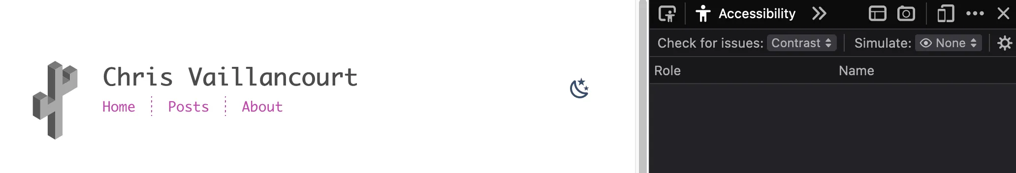
};Rerun Firefox’s accessibility checker and voila! No more color contrast issues:
See my theme module in Github for the actual implementation.